Multichannel IoT Causal (MIC) digital twin: Counterfactual experiments on Fence Graphs
Causality analysis is hard! But ignoring cross-channel causal effects is worse . . . At the outset, let me clarify that in the IoT context, Causal Analysis is NOT Feature Engineering (even though Causal Factors will make great features for condition monitoring and prediction — but that will be like using a bazzoka to kill a gnat!). Neither is it Simulation — sure, Causal Graph can be used for simulation but the point is that causal factors are required for Counterfactual experiments.
Causality theorists love “Counterfactuals”. In fact, a recent book (2021) by Marletto, “The Science of Can and Can’t”, has as sub-title: “A Physicist’s Journey Through the Land of Counterfactuals”; the author is in the process of reinterpreting all of known Physics (Newtonian to Quantum to Unified) using counterfactuals! Let us adopt Marletto’s lucid definition and example of “counterfactual”.
Counterfactual: What would have been true under different circumstances; Counterfactual statements refer to what is possible or impossible . . . as opposed to what happens.
Example: If kangaroos had no tail, they will topple over! Clearly, you cannot cut off kangaroos’ tails to do the experiment! But if we knew all the causal factors that keep them upright, we can simulate a kangaroo and remove the causal effect of the tail to see what happens . . . this is a counterfactual experiment.
Say, you have collected multichannel time series data from a rotating machine. You see a part failing and you have the concurrent data at hand. From our Causal Analysis toolkit, we have estimated the causal picture and see that a certain Causal Factor caused the failure. The *counterfactual* experiment that one can do is this: let us say we find that a specific Causal Factor had a high magnitude — this is the FACT; the “COUNTERFACT-ual” experiment is this: “What-if” that Causal Factor did not exist (was equal to zero)? This is still a “simulation” but we are simulating using Causal Factors . . . . MOST IMPORTANTLY, causal factors are estimated from the *measured data* unlike from some pre-selected Physics model where cause-effect relationships are predetermined, simplified and fixed. I hope you get a sense of the “counterfactual” approach (lots of things in Causality takes a while to settle in and become clear!).
In a recent article, I lamented the fact that IoT technologists in particular (and engineers in general) treat multichannel data as separate single-channel data streams — I likened it to “Usher Syndrome” where one’s vision is like “looking through straws”! This apex article will lead you to the rest of my technical articles: “Usher Syndrome in IoT — and a Cure” (June, 2021; https://pgmad.medium.com/usher-syndrome-in-iot-and-a-cure-4c32cf6ffd0a)
Let us clearly understand the cross-channel influences we are missing in the traditional engineering approach to multichannel time series analysis. By the way, Social Scientists, Health Scientists and Econometricians have been alert to the importance of cross-channel effects — my work stands on their shoulders . . .
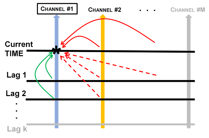
Figure 1 shows an M-channel timeseries. In traditional time series analysis (of the Box & Jenkins type), we will model each of the channels on its own, say as autoregressive models with some number of parameters, p, usually written as AR(p). So, we will have ‘M’ AR(p) models in hand. Figure 1 shows that if this is all you do, you are ignoring all the RED arrows! We call the SOLID-RED arrows as “inter-node” structural (INS) causal factors and DOTTED-RED as “inter-node” lagged (INL) causal factors.

Figure 1. Cross-channel effects in RED
In a typical application such as the NASA bearing data analysis we will discuss presently, number of Channels, M=4. Single-channel time series turned out to be AR(3)’s. So we have to additionally estimate 3 INS causal factors (solid arrows) and 9 INL causal factors (dotted arrows) just for the FULL analysis of ONE channel (Channel #1)!
In an early stage IoT data analysis, ignoring the 3+9 causal factors may be understandable. But the field is maturing and I believe that the lack of FULL analysis is holding IoT implementations back because we are not able to deliver FULL value of our analysis to business owners.
Actually, the situation is WORSE. Hyvarinen, in his 2010 article (Hyvarinen, et al., “Estimation of a Structural Vector Autoregression Model Using Non-Gaussianity”, Journal of Machine Learning Research, 2010) shows that if the INS factors (solid arrows) are ignored, they will then masquerade as self-channel’s coefficients and introduce errors in their estimation! Why has this very real estimation “pollution” problem not created a huge uproar in the engineering community? I suspect it is due to the use cases addressed. When Causal Factors are to be estimated so that we can PRESCRIBE actions derived from counterfactual experiments that yield business results, we have to hold our estimation methods to a higher standard!
Estimation
Estimation of Structural Vector AutoRegressive (SVAR) model parameters was fully addressed in my past publications, for example, “Causal Digital Twin from Multi-channel IoT” (https://arxiv.org/abs/2106.02135). Using a combination of Kalman Filtering and Hyvarinen’s “Lingam” algorithm, we address this SVAR model.

Test in a real-life setting was done using the popular NASA Prognostics Data Repository’s bearing dataset as before (for details, refer to any of my previous articles). The data is from a run-to-failure test setup of bearings installed on a shaft.
Causal Graph
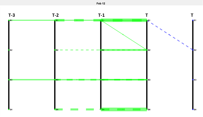
AR modeling of each of the 4 bearing data separately revealed that they AR(3) or AR(2) processes. In my previous article, we had ignored lags > 1; to perform Counterfactual experiments, that will not do. So the previous “LADDER” graph has to be extended to “FENCE” graph as shown in figure 2.

Figure 2. Fence Graph for Day-1 of testing — pristine condition
Most of the explanation from Ladder graph applies but for a quick review, the 5 “fence posts” represent the time index, current time on the extreme right marked as “T”, replicated again to be able to map “inter-node” structural (INS) causal factors. The rest are increasing lags from T-1 to T-3. In general, if there are M channels and pL is the largest model order of AR(p) models among all of the single channel time series, there will be M horizontal rungs in each panel and (pL + 2) vertical fence posts.
The four bearings, B1 to B4, are labeled vertically on each fence post with B1 at the top. BLUE lines indicate INS causal factors and GREEN indicate “inter-node” lagged (INL) causal factors. Solid line is for positive causal factors and dotted line for negative (Cause will reduce the Effect). Line width is proportional to the causal factor magnitude.
You can see that there is a dotted BLUE line on the right-most panel; this means that at the current instant, B1 has a negative (instantaneous) effect on B2. In the (T1-T) panel, we see 4 solid GREEN horizontal links — these are the first coefficients of AR(3) model of each of the 4 time series corresponding to B1 to B4 bearing vibration data. What is shown in figure 2 is for Day-1 of the test when all the mechanical components are in pristine condition — hence the minimal causal links (that are not horizontal which will always be the case unless the data is white noise) . . .
Now that you have some comfort level with our Fence Graph, we will investigate the condition on the day when B1 started to fail — “D-day”.
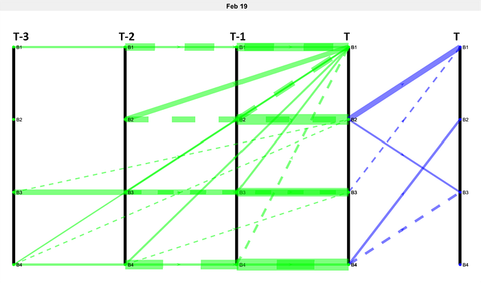
On D-day, B1 bearing started showing clear signs of failure. Fence Graph from SVAR estimation for a time block on that day is shown in figure 3.

Figure 3. B1 failure on D-day
It is amply clear that B1 was attracting a lot of attention on D-day! One large INS from B2 and INL from virtually every bearing and lags were affecting B1 — no wonder it failed . . .

It is important to compare the power spectrum of B1 data on Day-1 and D-day. With comparable y-axis, B1 spectrum has just a tiny peak at x=10 on Feb 12 (=Day-1). D-day (= Feb 19) has significant power spread all over the frequency range. A machine vibration expert may tell you that the peak on Day-1 is the “running frequency” driven by the A.C. induction motor of the test rig; the power at higher frequencies on D-day is called “bearing frequencies” that indicate roller element and inner/outer race defects; running frequency also exhibits harmonics at this time.
Counterfactual Experiment
To demonstrate the use of Fence Graph in a counter factual experiment, we have to simulate Bearing, B1, data using INS and INL causal factors estimated above. The simulation equation is as follows –

This equation is obtained directly by rearranging the terms of SVAR model equation from the earlier section and substituting S matrices estimated from data.
Even though the following did not happen (not a fact), what if we “counterfactually” set many of the positive INS and INL causal factors in figure 3 to zero? This is shown in figure 4.

Figure 4. Counterfactual experiment where the causal factors set to zero are shown with a cross
The simulation output of B1 bearing for D-day is shown below. Comparing this counterfactual experiment spectrum to the real data spectra from D-day and Day-1 shown earlier, it can be said that the system behaves more like on Day-1 than on D-day when certain causality factors were set to zero in this experiment.

The value of this exercise is two-fold:
1. A machine vibration analyst who is an expert at reading the vibration spectrum “tea leaves” may now be able to relate rules-of-thumb and gut-feelings to specific causal factors. This is the real starting point for PRESCRIPTIVE analytics where operation/ system design improvements are discovered.
2. The interaction of various causal factors can be automated in a major optimization exercise. This will become necessary since a human will have difficulty in identifying which causal factor changes will lead to optimal results. It is also likely that causal factor changes will interact — TUNING the causal factors simultaneously in a large Counterfactual experiment optimization run will become a compelling need.
As I have pointed out in my previous articles, applications are many. Wherever there is IoT data as multi-channel time series, our Fence Graph digital twin can be applied for causal discovery, causal estimation and counterfactual experiments to achieve significant operational objectives as the examples below show.
Consider the following IoT use cases that generate multi-channel time series:
1. A manufacturing plant production line with a set of machines with connected sensors; objective: Increase Production
2. A building with monitoring data from HVAC system, occupancy, lights and computer operation, water usage; objective: Minimize energy usage
3. A retail store that monitors shelf facings, back-room store, shopper density, POS terminal data; objective: Reduce OOS (out-of-stock) problem
4. A smart city operation where multiple feeder road traffic and major intersections are monitored in real-time; objective: Real-time traffic engineering to minimize congestion at the intersection
Multi-channel IoT Causal (MIC) Digital Twin & the future of IoT
It is not a stretch to say that almost all IoT applications today are “Condition Monitoring” use cases in one way or the other. I don’t mean just machinery IoT applications; for example, Smart City is about monitoring the condition of traffic, pollution, energy use, etc. IoT platform brings these channels of data into one place — followed by human visual inspection of the “condition” or a “metric” derived by combining some data that is displayed. This is a good start . . .
There are two directions to go from here: (1) Feed the condition information back to control some operational aspect(s) on the ground — a closed-loop IoT system and (2) Go beyond condition monitoring using “visible data” and unearth deeper facts about the system being monitored.
It is the second aspect that this article addresses. As the saying goes, “Causality is the most important connection in the Universe”. In the case of IoT enabled systems at least, cause-and-effect determines all the system behaviors! In MIC digital twin and Fence Graph, we have a complete solution to estimate and experiment with causal factors — to go beyond condition monitoring, we require Fence Graph.
Every IoT application I know monitors multiple channels of data from one asset or multiple interconnected assets. Not processing them to result in Fence Graphs with all the inter-node causes revealed will result in erroneous estimates of single-channel, one at a time, parameter estimation as mentioned in the previous section. So traditional single channel analysis methods are not only inadequate but also misleading!
I believe that IoT technology is now ready to go beyond “looking through straws” and extract the FULL picture to help our clients improve productivity and quality as well as reduce waste, thus increasing gross margins.
Dr. PG Madhavan
https://www.linkedin.com/in/pgmad/
#IoT #Multichannel #Digitaltwin #Causaldigitaltwin #Fencegraph #Causality
